
Part of 100+ video lessons
Short, step-by-step lessons you can rewatch anytime.
Hands-on project
Follow along in the host project and build as you learn.
Certificate path
Counts toward your Framer Fundamentals certificate.


Set the container, then each child, then add constraints where things get extreme.
Usually fill for width and fit for height, so the section grows with its content.
Fill for the flexible element, fit for the ones that should wrap their content.
Constraints stop text lines stretching too long on wide screens and squashing on small ones.

BUILD LAYOUTS THAT RESPOND ON THEIR OWN
Combine sizing modes so fewer breakpoint fixes are needed.
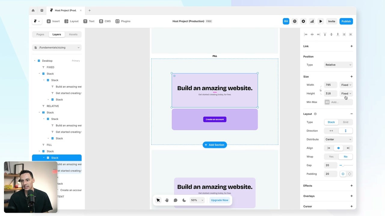
KNOW WHEN TO USE FIXED, FILL OR FIT
Pick the sizing mode that matches what the element should actually do.

CONTROL EXTREMES WITH CONSTRAINTS
Use min and max widths to keep content readable at any screen size.

Layout in Framer
Framer's layout system works like auto layout in Figma or Flexbox in Webflow. Learn how stacks and grids bring alignment and order to your elements.

Breakpoints in Framer
Breakpoints are different layouts of the same page for different screen sizes. Set up desktop, tablet and phone so one page works everywhere.

CURRICULUM
WHAT YOU’LL LEARN IN THIS COURSE
In the Ultimate Framer Masterclass, you’ll master Framer from the ground up. Follow real projects, get expert feedback, and finally design and ship the way you’ve always wanted to.
Take a two-column section, set one column to fill and the other to fit, then add a max width to the text and resize the window.
07:30
PUBLISH CHECKLIST
Container sized
Children sized
No stray fixed widths
Max width on text
Min width checked
Tested at phone width
TRY IT OUT
Cesar Rodrigues
Founder, Craate Creative
FREQUENTLY ASKED QUESTIONS
Everything you need to know about this lesson.
What's the difference between fill and fit in Framer?
Fill stretches the element to take the available space in its parent. Fit shrinks it to wrap whatever sits inside it.
Why does my layout break on mobile in Framer?
Usually a fixed width that can't shrink. Swap it for fill, and add a max width if you need to cap it on large screens.
How do min and max width work in Framer?
They set boundaries a flexible element can't cross, so text doesn't stretch into unreadable lines on wide screens or squash on narrow ones.
CERTIFICATION
BECOME A CERTIFIED FRAMER MASTER
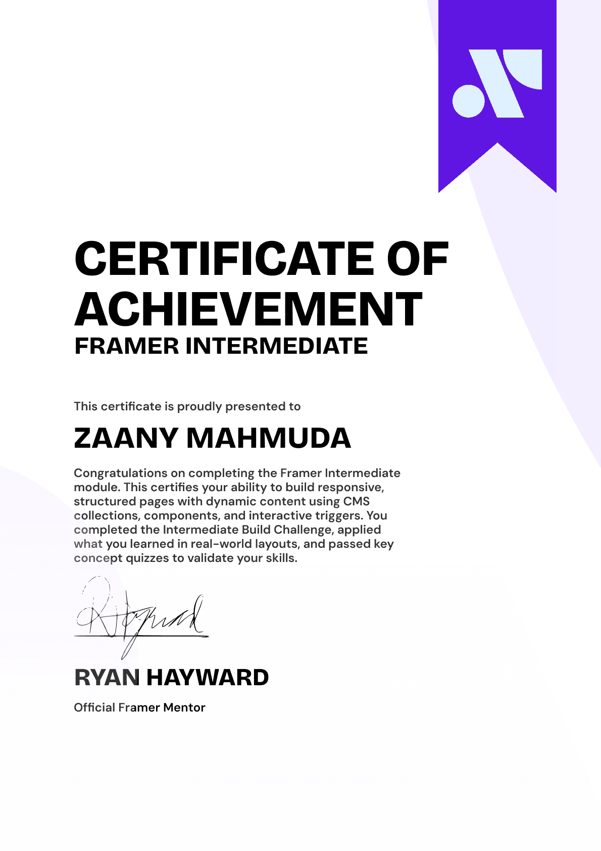
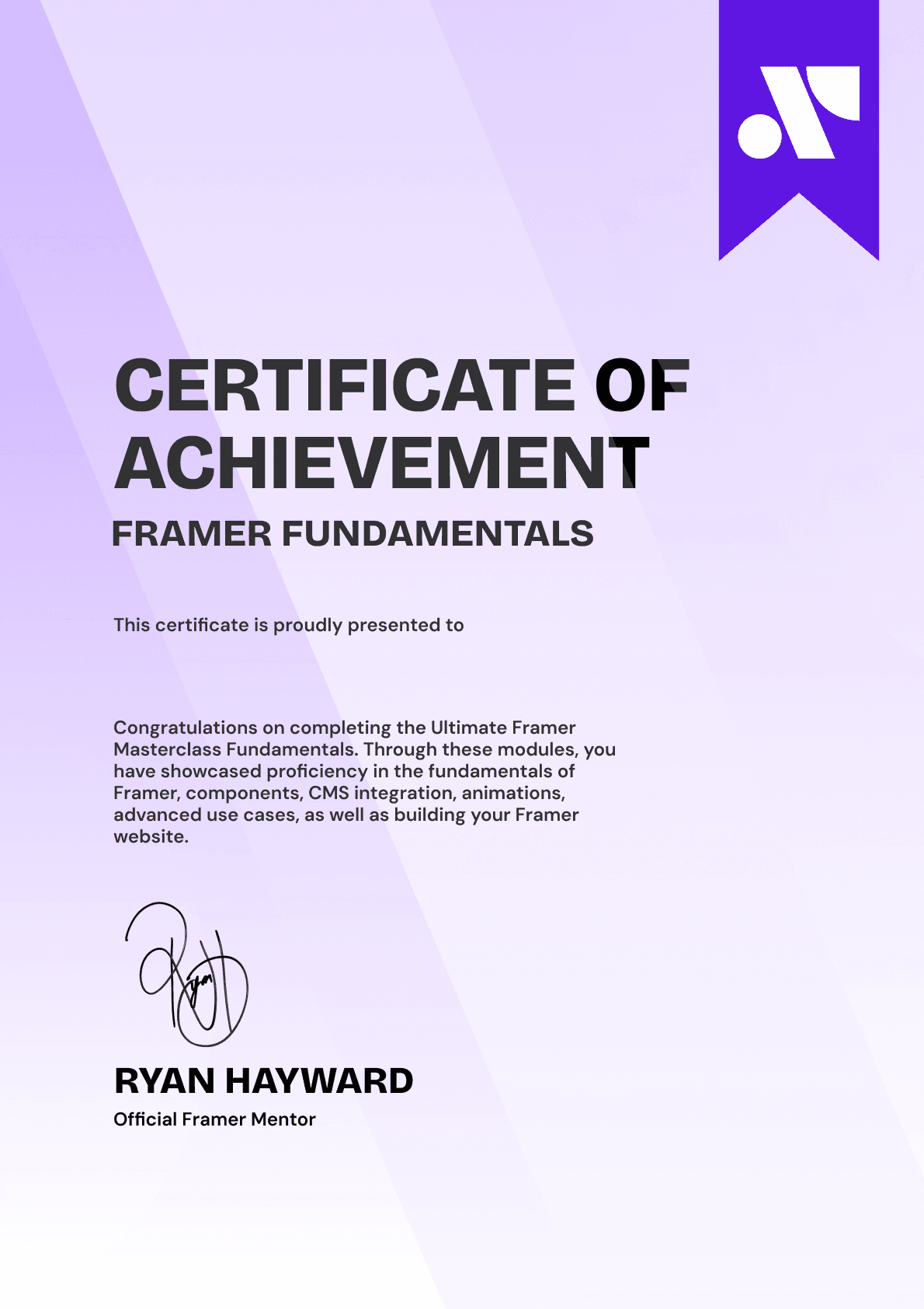
Earn 3 official certifications that show you don’t just know Framer, but you can
design, build, and execute real pixel-perfect sites.







Rated excellent by 900+ students
4.8
Lifetime access
14-day money-back guarantee
Stream anywhere