NEW: The Framer Agent Playbook early bird ends in |

00:00:00:00

NEW: The Framer Agent Masterclass | Save $100, early bird ends in |

00:00:00:00

USE CODE “FRAMERFRIDAY” AT CHECKOUT TO SAVE 20% — ALL DEALS  HERE
NEW: The Framer Agent Playbook | Save $100, early bird ends in |

00:00:00:00

Not sure where to start?

Get your personalised Framer roadmap

Answer 4 questions and get a clear picture of where you're at, and exactly what to do next.

Not sure where to start?

Get your personalised Framer roadmap

Answer 4 questions and get a clear picture of where you're at, and exactly what to do next.

Are you ready to master Framer?

Are you ready to master Framer?

Rated excellent by 900+ students

Brooke kong
Brooke kong
Brooke kong
Brooke kong
Brooke kong

Breakpoints in Framer

Breakpoints in Framer

Breakpoints in Framer

Breakpoints are different layouts of the same page for different screen sizes. Set up desktop, tablet and phone so one page works everywhere.

Breakpoints are different layouts of the same page for different screen sizes. Set up desktop, tablet and phone so one page works everywhere.

Breakpoints are different layouts of the same page for different screen sizes. Set up desktop, tablet and phone so one page works everywhere.

Fundamentals

·

06:07

·

with Ryan Hayward

Part of 100+ video lessons

Short, step-by-step lessons you can rewatch anytime.

Hands-on project

Follow along in the host project and build as you learn.

Certificate path

Counts toward your Framer Fundamentals certificate.

HOW BREAKPOINTS WORK IN FRAMER

HOW BREAKPOINTS WORK IN FRAMER

A change on the desktop breakpoint flows down to tablet and phone. A change on a smaller breakpoint stays there. That one rule is what keeps a responsive site manageable.

A change on the desktop breakpoint flows down to tablet and phone. A change on a smaller breakpoint stays there. That one rule is what keeps a responsive site manageable.

Desktop and tablet breakpoints side by side on one page (Breakpoints lesson, 1:20)
Restyling the hero section on the tablet breakpoint (Breakpoints lesson, 2:20)

SET UP YOUR BREAKPOINTS

SET UP YOUR BREAKPOINTS

Add the tablet and phone views, restyle what breaks, then preview at each width.

Add a breakpoint

Add a breakpoint

Desktop exists by default. Click the plus for tablet, phone or a custom width.

Know where each one starts

Know where each one starts

Desktop covers 1200px and up. Tablet takes over at 1199px and below.

Restyle, don't rebuild

Restyle, don't rebuild

Switch stack direction, change alignment, resize images and swap fixed widths for fill.

BY THE END OF THIS LESSON, YOU WILL:

BY THE END OF THIS LESSON, YOU WILL:

The hero section previewed at a narrow width (Breakpoints lesson, 4:50)

0:45

The hero section previewed at a narrow width (Breakpoints lesson, 4:50)

0:45

BUILD ONE PAGE THAT WORKS ON EVERY SCREEN

Set up desktop, tablet and phone layouts without duplicating the page.

Fixing the stack direction and alignment on the phone breakpoint (Breakpoints lesson, 3:50)

3:43

Fixing the stack direction and alignment on the phone breakpoint (Breakpoints lesson, 3:50)

3:43

FIX THE LAYOUTS THAT BREAK

Change stack direction and distribution, and swap fixed widths for fill.

All three breakpoints, showing how desktop edits cascade down (Breakpoints lesson, 5:50)

5:12

All three breakpoints, showing how desktop edits cascade down (Breakpoints lesson, 5:50)

5:12

KNOW WHICH CHANGES CASCADE

Desktop edits flow down to every smaller breakpoint. Smaller edits stay put.

RELATED LESSONS

RELATED LESSONS

Layout lesson card

Layout in Framer

Framer's layout system works like auto layout in Figma or Flexbox in Webflow. Learn how stacks and grids bring alignment and order to your elements.

Ultimate Framer Masterclass lesson card: Key concepts and terminology, with Ryan Hayward and a grid of cards

Understanding Frames

Every great site starts with frames, Framer's core building block. In this foundational lesson you'll learn what frames are, how they work, and why they're essential to everything you'll design going forward.

Building a Responsive Navbar in Framer lesson card

Animating a Navbar in Framer

Take a navbar component and bring it to life: a mega menu on hover, a start state that animates in on load, and an appear effect that slides it down from the top.

CURRICULUM

WHAT YOU’LL LEARN IN THIS COURSE

In the Ultimate Framer Masterclass, you’ll master Framer from the ground up. Follow real projects, get expert feedback, and finally design and ship the way you’ve always wanted to.

Fundamentals

Fundamentals

Take a hero section and make it work on tablet and phone. Restyle only what breaks, then preview at every width.

06:07

PUBLISH CHECKLIST

Tablet breakpoint added

Phone breakpoint added

Stack direction fixed on phone

Fixed widths swapped for fill

Previewed at each width

Desktop edits checked for knock-on changes

TRY IT OUT

Our team went from guessing to actually knowing what we’re doing. We’re working faster, staying on brand, and delivering better work overall.

Our team went from guessing to actually knowing what we’re doing. We’re working faster, staying on brand, and delivering better work overall.

Cesar Rodrigues

FREQUENTLY ASKED QUESTIONS

Everything you need to know about this lesson.

How do breakpoints work in Framer?

A change on the desktop breakpoint flows down to tablet and phone. A change made on a smaller breakpoint stays only there. That one rule keeps a responsive site manageable.

What widths do Framer breakpoints start at?

Desktop covers 1200px and up. Tablet takes over at 1199px and below, and phone covers the smallest widths. You can also add a breakpoint at a custom width.

Do I have to rebuild my page for mobile in Framer?

No. You restyle rather than rebuild: switch stack direction, change alignment, resize images and swap fixed widths for fill. It stays one page across every breakpoint.

CERTIFICATION

BECOME A CERTIFIED FRAMER MASTER

Earn 3 official certifications that show you don’t just know Framer, but you can
design, build, and execute real pixel-perfect sites.

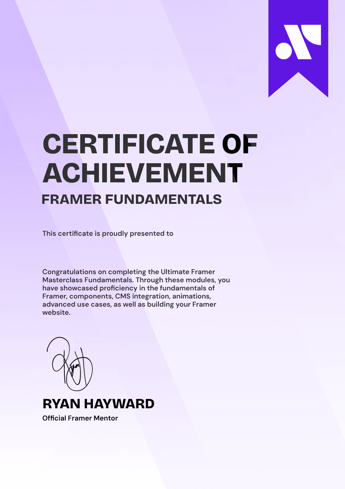
Ultimate Framer Masterclass expert certificate of completion with Framer x insert frame branding.
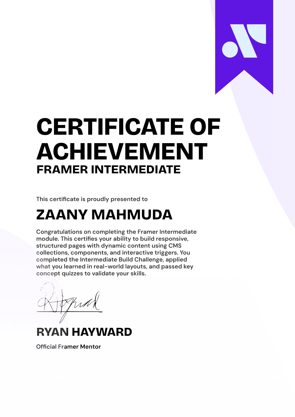
Ultimate Framer Masterclass intermediate certificate of completion with Framer x insert frame branding.
Ultimate Framer Masterclass Beginner certificate of completion with Framer x insert frame branding.
Ultimate Framer Masterclass expert certificate of completion with Framer x insert frame branding.
Ultimate Framer Masterclass intermediate certificate of completion with Framer x insert frame branding.
Ultimate Framer Masterclass Beginner certificate of completion with Framer x insert frame branding.
Purple gradient background for Ultimate Framer Masterclass hero section.
Brooke kong
Brooke kong
Brooke kong
Brooke kong
Brooke kong

Rated excellent by 900+ students

4.8

DO MORE THAN LEARN FRAMER. MASTER IT.

DO MORE THAN LEARN FRAMER. MASTER IT.

Enroll in the Ultimate Framer Masterclass.
I'll see you in the first lesson.

Enroll in the Ultimate Framer Masterclass.
I’ll see you in the first lesson.

Lifetime access

14-day money-back guarantee

Stream anywhere
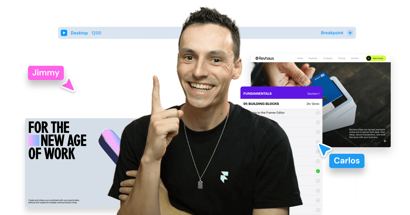
Ryan Hayward and the lesson thumbnails speaking about the Ultimate Framer Masterclass.
Ultimate Framer Masterclass Badge

A complete learning experience & course for Framer by Ryan Hayward + Insert Frame Education

© 2026 Insert Frame Pty LTD

Proudly built with Framer

More Insert Frame products

A complete learning experience & course for Framer by Ryan Hayward + Insert Frame Education

© 2026 Insert Frame Pty LTD

Proudly built with Framer

More Insert Frame products

A complete learning experience & course for Framer by Ryan Hayward + Insert Frame Education

© 2026 Insert Frame Pty LTD

Proudly built with Framer

More Insert Frame products